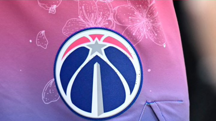
Despite the pregame fashion shows from Kyle Kuzma, one of the weakest aspects of the Washington Wizards franchise is their poor fashion. There has never been an iconic jersey to grace the backs of any player in the history of the team, and the logo fails to represent the team’s name in any aspect.
This is why it may be important for the team to refresh the franchise with a fresh new look this offseason. While a full rebrand may not be the best decision at this point, a new look like what the Cleveland Cavaliers or Utah Jazz did a year ago may do wonders for the team.
Often times when teams decide to redesign their jerseys or logo, it’s to signify a major change within the organization. Few teams in recent memory have gone through such a complete reset quite like the Wizards this offseason. With a completely reorganized front office, coaching staff, and roster, they are certainly turning a corner.
What could a potential new logo look like for the Washington Wizards?
Right now, the Wizards logo is a simple circle logo with the Washington Monument at its center. This is a great tribute to the city the team calls home and would be great on a city jersey but doesn’t quite live up to the name of the franchise.
This is an area where going modern may be best. Keeping the circle logo idea that has seemingly taken the NBA by storm in the past decade, they could easily add a Wizard similar to the Dallas Mavericks and the direction they went with their logo.
They could sneak the letter W into the logo a few times as well to represent both Washington and the Wizards similar to the Milwaukee Bucks logo.
For the secondary logo, a potential idea by Tik Tok user @jakeyian included bringing back the tip ball element from the old Bullets logo and using the hand as the line in the back of a d in a lowercase ‘dc’. This is an incredibly intriguing idea that could help the team refresh their look.
How could the team jerseys look in a soft rebrand?
The Washington Wizards are one of the few teams in NBA history to never have a truly great jersey to look back on. The Toronto Raptors have their dinosaur uniforms, and the Utah Jazz have their mountain range looks, the best the Wizards have for a main uniform is the Gilbert Arenas era white and blue jerseys that made a comeback this year. Not great.
However, the Wizards have consistently had some great individual aspects to their jersey designs. They have had a few jerseys with stars on the side and a current jersey that features stripes. Both of these aspects perfectly represent being located in the capital of the United States.
It would be interesting to see the Wizards combine these two designs into their primary jerseys along with an updated logo. Even better, they could have three stars on each side to represent the District of Columbia, Maryland, and Virginia.
For a city jersey, something that typically changes every year, it would be interesting to see them lean into their current logo to say goodbye if they do decide to rebrand. They could use the Washington Monument as side stripes, the current logo, and three stars surrounding the logo (again, to represent the DMV).
While this likely isn’t at the forefront of any discussions behind the scenes, this would be a smart move for the Washington Wizards as they usher in a new era.
